Responsive design has been a perennial topic in online business ever since looking things up on the internet stopped depending on a desktop computer with a connection. Anyone who owns a smartphone or tablet can browse the vast expanses of the web from the comfort of their armchair or on the move. For publishers and website owners, that is a real challenge, because they have to cater for screen sizes that follow no standard.
There are tiny smartphones that are not really made for surfing but are still connected and come with a browser. There are notebooks, netbooks and ultrabooks, all fully fledged computers, with a wide range of screen sizes. And there are tablets, which sit somewhere between a smartphone and a small computer. It is a bit as if the small devices finally wanted to grow up and the bigger ones wanted to shrink.
The challenge for website owners is to deliver their content so that people on all these different devices can reach the information they want with equal ease and comfort. If that information is text, the solution is simple: font sizes are easy to adjust and lines can break anywhere. But what about all those lovely images, graphics, diagrams and charts?
You can see it on older websites. Web designers used to treat the monitor as the standard and built graphics and charts at a size optimised for at least medium-sized screens. View one of those graphics on a smartphone and you have to “swipe”. That, of course, breaks the reading flow of the article wrapped around the large graphic.
Technologies such as HTML5 and CSS3 solve this. Used on a website, they adapt embedded graphics to the viewer’s screen. Images become “responsive”. When a page is requested, the user’s device sends information such as the device type, operating system and screen resolution. Based on this, the website can serve the layout tailored exactly to that device. But the job is not done yet!
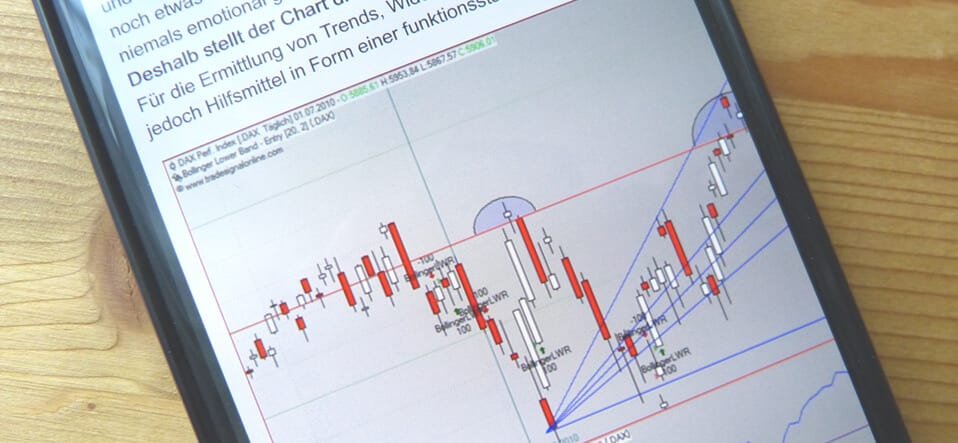
While publishers can make layout, navigation and most content responsive with the programming options of HTML5 and CSS3, simply scaling images is not always sensible. Technically, it is no problem at all. But what use is a chart to the reader if its curves or price movements can no longer be made out?
Ideally, you offer your readers every image in several sizes. A professionally built website then picks the graphic in the right format automatically. Yet even the smartest website cannot decide whether the content is still fit for the human eye. This is where a person has to step in, make the call and ensure the content is presented in the best possible way for the user.
The bottom line: technically, responsive display is becoming less and less of a problem. When it comes to content, however, it is ultimately a person who has to judge and decide which graphic or image is used, and how.